
このページは、github.comに登録されているMetroRadiance.ForkのREADME.mdを日本語化したものです。英語版は、github.comを参照してください。
このページの内容は、MetroRadiance.Fork 3.1.0 相当の内容が翻訳されています。
MetroRadiance.Forkの日本語トップページへ戻る
MetroRadiance.Fork: 


( MetroRadiance: )


 )
)
Visual Studio 2012/2013/2015のようなWPFウィンドウを作るためのUIコントロールライブラリです。
MetroRadiance.Forkは、MetroRadiance 2.4.0からフォーク(分岐)して作成されています。
インストール方法
NuGetパッケージをインストールします。
PM> Install-Package MetroRadiance.ForkMetroRadiance.Fork.Core– MetroRadianceコアライブラリーMetroRadiance.Fork.Chrome– WPFウィンドウのためのクロムライブライリーMetroRadiance.Fork– WPF カスタムコントロールライブラリー
特徴と使い方
MetroRadiance.Core
[-v2.5.0]DPI / Per-Monitor DPI のサポート機能
- VisualからシステムDPIを取得する
- HwndSource または、windowハンドルからモニターDPIを取得する
using MetroRadiance.Interop;// Get system dpi
var systemDpi = window.GetSystemDpi();
if (PerMonitorDpi.IsSupported)
{
// Get monitor dpi.
var hwndSource = (HwndSource)PresentationSource.FromVisual(this);
var monitorDpi = hwndSource.GetDpi();
}[v3.0.0-] DPI / Per-Monitor DPI のサポート機能
- システムDPIを取得する
- モニターハンドルからモニターDPIを取得する
- VisualからウィンドウDPIを取得する
- HwndSource または、windowハンドルからウィンドウDPIを取得する
using MetroRadiance.Platform;// Get system dpi.
var systemDpi = DpiHelper.GetDpiForSystem();
// Get monitor dpi.
var monitorDpi = DpiHelper.GetDpiForMonitor(hMonitor);
// Get window dpi from HwndSource.
var hwndSource = (HwndSource)PresentationSource.FromVisual(this);
var windowDpi = hwndSource.GetDpi();
// Get window dpi from window handle.
var windowDpi = DpiHelper.GetDpiForWindow(hWnd);Windows テーマのサポート機能
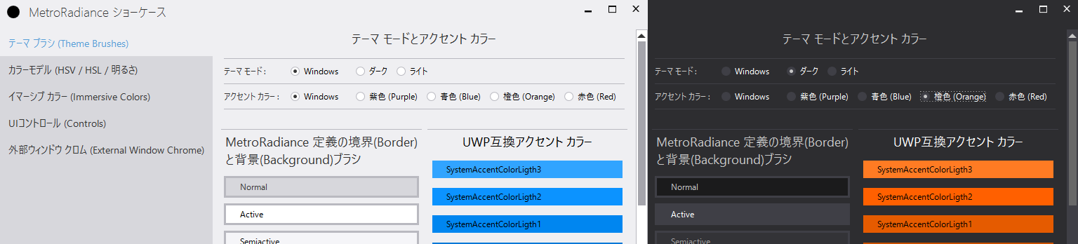
Windowsのテーマに関する各種設定を取得できます。
- アプリテーマ(app theme)設定の取得 (
WindowsTheme.Theme, Light or Dark, Windows 10以降のみ) - システムテーマ(system theme)設定の取得 (
WindowsTheme.SystemTheme, Light or Dark, Windows 10以降のみ) - アクセントカラー(accent color)設定の取得 (
WindowsTheme.Accent) - 高コントラスト(high Contrast)モード設定の取得 (
WindowsTheme.HighContrast) - タイトルバーなどの色指定(Color prevalence)設定の取得 (
WindowsTheme.ColorPrevalence) - 透過率(transparency)の設定 (
WindowsTheme.Transparency) - [v3.0.0-] テキストスケール率(text scale factor)設定の取得 (
WindowsTheme.TextScaleFactor) - Windowsのテーマ関連プロパティの変更通知機能(
RegisterListener())
using MetroRadiance.Platform;// Get Windows accent color
var color = WindowsTheme.Accent.Current;
// Subscribe accent color change event from Windows theme.
var disposable = WindowsTheme.Accent.RegisterListener(color =>
{
// apply color to your app.
});
// Unsubscribe color change event.
disposable.Dispose();HSV/HSL カラーモデルと明度の計算に関するサポート機能
using MetroRadiance.Media;// Get Windows accent color (using MetroRadiance.Platform;)
var rgbColor = WindowsTheme.Accent.Current;
// Convert from RGB to HSV color.
var hsvColor = rgbColor.ToHsv();
hsvColor.V *= 0.8;
// Convert from HSV to RGB color.
var newColor1 = hsvColor.ToRgb();
// [v3.0.0-] Convert from RGB to HSL color.
var hslColor = rgbColor.ToHsv();
hslColor.L *= 0.8;
// [v3.0.0-] Convert from HSL to RGB color.
var newColor2 = hslColor.ToRgb();
// Calculate luminosity from RGB color.
var luminosity = Luminosity.FromRgb(rgbColor);MetroRadiance.Chrome
WPFのウィンドウの外観(非クライアント領域、Window chrome)をVisual Studioのような外観にする
MetroRadiance.Chrome.WindowChrome
<Window xmlns:chrome="http://schemes.grabacr.net/winfx/2014/chrome">
    <chrome:WindowChrome.Instance>
        <chrome:WindowChrome />
    </chrome:WindowChrome.Instance>
</Window>
ウィンドウの外観(非クライアント領域、Window chrome)にUI要素を追加する
MetroRadiance.Chrome.WindowChrome.Top/.Left/.Right/.Bottom
<Window xmlns:chrome="http://schemes.grabacr.net/winfx/2014/chrome">
    <chrome:WindowChrome.Instance>
        <chrome:WindowChrome>
            <chrome:WindowChrome.Top>
                <Border Background="DarkRed"
                        Padding="24,3"
                        Margin="8,0"
                        HorizontalAlignment="Right">
                    <TextBlock Text="any UI elements"
                               Foreground="White" />
                </Border>
            </chrome:WindowChrome.Top>
        </chrome:WindowChrome>
    </chrome:WindowChrome.Instance>
</Window>
MetroRadiance
テーマに関するサポート機能
// Change theme.
ThemeService.Current.ChangeTheme(Theme.Dark);

// Change theme (sync Windows)
ThemeService.Current.ChangeTheme(Theme.Windows);

// Change Accent
ThemeService.Current.ChangeAccent(Accent.Blue);

// Change accent (sync Windows)
ThemeService.Current.ChangeAccent(Accent.Windows);

// Change accent (from RGB Color)
var accent = Colors.Red.ToAccent();
ThemeService.Current.ChangeAccent(accent);
[v3.0.0-] MetroRadianceが定義するUWP互換の色とブラシのリソース
MetroRadianceは、UWP互換の色(Color)とブラシ(Brush)のリソースを定義します。
リソース名はUWPのルールに従います。命名規則はここ (Microsoft site)にあります。
WPFではThemeResource として、これらのリソースを使うことはできません。
WPFのコントロールで、DynamicResource としてこれらのリソースを使うと、テーマカラーと連動して動作します。
これらのリソースは、以下の手順で有効化できます。
- WPF XAML (App.xaml.cs)に定義する(コードビハインド)
アプリはRegister()を呼び出す前に、EnableUwpResoruces()を呼び出すことにより、UWP互換リソースを有効化します。この方法は、アプリ全体にUWP互換リソースを有効化します。
    using MetroRadiance.UI;

    public partial class App : Application
    {
        protected override void OnStartup(StartupEventArgs e)
        {
            base.OnStartup(e);
            ThemeService.Current.EnableUwpResoruces();
            ThemeService.Current.Register(this, Theme.Windows, Accent.Windows);
...- WPF XAML (App.xaml以外)に定義する(マークアップ)
この方法は、指定したオブジェクト(Window、コントロールなど)のみにUWP互換リソースを有効化します。- Window/Controlなどのオブジェクトに、添付プロパティHasThemeResourceを、
ThemeHelper.HasThemeResources="True"のようにTrueに設定します。 - MetroRadianceコンポーネントで定義されているUWPリソース (…/Themes/UWP/….xaml)を少なくとも一つマージます。
- Window/Controlなどのオブジェクトに、添付プロパティHasThemeResourceを、
  <UserControl x:Class="MetroRadiance.Showcase.UI.UwpBrushSamples"
    ...
    xmlns:metro="http://schemes.grabacr.net/winfx/2014/controls"
    metro:ThemeHelper.HasThemeResources="True">

    <UserControl.Resources>
        <ResourceDictionary>
            <ResourceDictionary.MergedDictionaries>
                <ResourceDictionary Source="pack://application:,,,/MetroRadiance;component/Themes/UWP/Dark.xaml" />
            </ResourceDictionary.MergedDictionaries>
    ...
MetroRadianceコンポーネントで定義されているUWPリソース ファイルの一覧
/Themes/UWP/Light.xaml/Themes/UWP/Dark.xaml/Themes/UWP/HighContrast.xaml/Themes/UWP/Accents/Blue.xaml/Themes/UWP/Accents/Orange.xaml/Themes/UWP/Accents/Purple.xaml
アプリはこれらのリソースファイルをプリフィックス("pack://application:,,,/MetroRadiance;component/")を付加して、参照することができます。
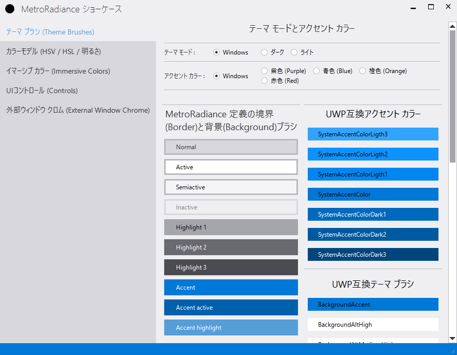
MetroRadianceが定義するカスタムの色とブラシのリソース
MetroRadianceは、独自の色(Color)とブラシ(Brush)のリソースを定義します。
リソースキーの命名規則は[ColorName]ColorKey と [ColorName]BrushKeyです。
WPFではThemeResource として、これらのリソースを使うことはできません。
WPFのコントロールで、DynamicResource としてこれらのリソースを使うと、テーマカラーと連動して動作します。
これらのリソースは、以下の手順で有効化できます。
- WPF XAML (App.xaml.cs)に定義する(コードビハインド)
アプリはRegister()を呼び出すことにより、カスタムの色やブラシのリソースを有効化します。この方法は、アプリ全体にカスタムリソースを有効化します。
    using MetroRadiance.UI;

    public partial class App : Application
    {
        protected override void OnStartup(StartupEventArgs e)
        {
            base.OnStartup(e);
            ThemeService.Current.Register(this, Theme.Windows, Accent.Windows);
...- WPF XAML (App.xaml以外)に定義する(マークアップ)
この方法は、指定したオブジェクト(Window、コントロールなど)のみにカスタムリソースを有効化します。- Window/Controlなどのオブジェクトに、添付プロパティHasThemeResourceを、
ThemeHelper.HasThemeResources="True"のようにTrueを設定します。
- Window/Controlなどのオブジェクトに、添付プロパティHasThemeResourceを、
  <UserControl x:Class="MetroRadiance.Showcase.UI.BrushSamples"
    ...
    xmlns:metro="http://schemes.grabacr.net/winfx/2014/controls"
    metro:ThemeHelper.HasThemeResources="True">
    ...
MetroRadianceコンポーネントで定義されているカスタムリソース ファイルの一覧
/Themes/Light.xaml/Themes/Dark.xaml/Themes/Accents/Blue.xaml/Themes/Accents/Orange.xaml/Themes/Accents/Purple.xaml
アプリはこれらのリソースファイルをプリフィックス("pack://application:,,,/MetroRadiance;component/")を付加して、参照することができます。
| 色の名前 | サンプル | 色のリソースキー (Color key) | ブラシのリソースキー (Brush key) |
|---|---|---|---|
| Theme | Light/Dark | ThemeColorKey | ThemeBrushKey |
| Background | Light/Dark | BackgroundColorKey | BackgroundBrushKey |
| Border | Light/Dark | BorderColorKey | BorderBrushKey |
| Foreground | Light/Dark | ForegroundColorKey | ForegroundBrushKey |
| SemiactiveBackground | Light/Dark | SemiactiveBackgroundColorKey | SemiactiveBackgroundBrushKey |
| SemiactiveBorder | Light/Dark | SemiactiveBorderColorKey | SemiactiveBorderBrushKey |
| SemiActiveForeground | Light/Dark | SemiActiveForegroundColorKey | SemiActiveForegroundBrushKey |
| ActiveBackground | Light/Dark | ActiveBackgroundColorKey | ActiveBackgroundBrushKey |
| ActiveBorder | Light/Dark | ActiveBorderColorKey | ActiveBorderBrushKey |
| ActiveForeground | Light/Dark | ActiveForegroundColorKey | ActiveForegroundBrushKey |
| InactiveBackground | Light/Dark | InactiveBackgroundColorKey | InactiveBackgroundBrushKey |
| InactiveBorder | Light/Dark | InactiveBorderColorKey | InactiveBorderBrushKey |
| InactiveForeground | Light/Dark | InactiveForegroundColorKey | InactiveForegroundBrushKey |
| HighlightBackground | Light/Dark | HighlightBackgroundColorKey | HighlightBackgroundBrushKey |
| HighlightBorder | Light/Dark | HighlightBorderColorKey | HighlightBorderBrushKey |
| HighlightForeground | Light/Dark | HighlightForegroundColorKey | HighlightForegroundBrushKey |
| Highlight2Background | Light/Dark | Highlight2BackgroundColorKey | Highlight2BackgroundBrushKey |
| Highlight2Border | Light/Dark | Highlight2BorderColorKey | Highlight2BorderBrushKey |
| Highlight2Foreground | Light/Dark | Highlight2ForegroundColorKey | Highlight2ForegroundBrushKey |
| Highlight3Background | Light/Dark | Highlight3BackgroundColorKey | Highlight3BackgroundBrushKey |
| Highlight3Border | Light/Dark | Highlight3BorderColorKey | Highlight3BorderBrushKey |
| Highlight3Foreground | Light/Dark | Highlight3ForegroundColorKey | Highlight3ForegroundBrushKey |
| LinkForeground | Light/Dark | LinkForegroundColorKey | LinkForegroundBrushKey |
| ActiveLinkForeground | Light/Dark | ActiveLinkForegroundColorKey | ActiveLinkForegroundBrushKey |
| ValidationError | Light/Dark | ValidationErrorColorKey | ValidationErrorBrushKey |
| 色の名前 | サンプル | 色のリソースキー (Color key) | ブラシのリソースキー (Brush key) |
|---|---|---|---|
| Accent | Blue/Orange/Purple | AccentColorKey | AccentBrushKey |
| AccentHighlight | Blue/Orange/Purple | AccentHighlightColorKey | AccentHighlightBrushKey |
| AccentActive | Blue/Orange/Purple | AccentActiveColorKey | AccentActiveBrushKey |
| AccentForeground | Blue/Orange/Purple | AccentForegroundColorKey | AccentForegroundBrushKey |
カスタムリソースを使ったコントロールのスタイルの定義例
<Style TargetType="{x:Type Button}">
    <Setter Property="Background"
            Value="{DynamicResource BackgroundBrushKey}" />
    <Setter Property="BorderBrush"
            Value="{DynamicResource BorderBrushKey}" />
    <Setter Property="Foreground"
            Value="{DynamicResource ActiveForegroundBrushKey}" />
    <Setter Property="BorderThickness"
            Value=".99" />
    <Setter Property="Padding"
            Value="8,2" />
    <Setter Property="FocusVisualStyle"
            Value="{DynamicResource {x:Static SystemParameters.FocusVisualStyleKey}}" />
    <Setter Property="Template">
        <Setter.Value>
            <ControlTemplate TargetType="{x:Type Button}">
                <Border BorderBrush="{TemplateBinding BorderBrush}"
                        BorderThickness="{TemplateBinding BorderThickness}"
                        SnapsToDevicePixels="{TemplateBinding SnapsToDevicePixels}"
                        Background="{TemplateBinding Background}">
                    <ContentPresenter x:Name="contentPresenter"
                                        Margin="{TemplateBinding Padding}"
                                        HorizontalAlignment="{TemplateBinding HorizontalContentAlignment}"
                                        VerticalAlignment="{TemplateBinding VerticalContentAlignment}" />
                </Border>
            </ControlTemplate>
        </Setter.Value>
    </Setter>
    <Style.Triggers>
        <Trigger Property="IsMouseOver"
                    Value="True">
            <Setter Property="Background"
                    Value="{DynamicResource ActiveBackgroundBrushKey}" />
            <Setter Property="BorderBrush"
                    Value="{DynamicResource ActiveBorderBrushKey}" />
        </Trigger>
        <Trigger Property="IsPressed"
                    Value="True">
            <Setter Property="Background"
                    Value="{DynamicResource AccentBrushKey}" />
            <Setter Property="BorderBrush"
                    Value="{DynamicResource ActiveBorderBrushKey}" />
            <Setter Property="Foreground"
                    Value="{DynamicResource AccentForegroundBrushKey}" />
        </Trigger>
        <Trigger Property="IsEnabled"
                    Value="False">
            <Setter Property="Background"
                    Value="{DynamicResource InactiveBackgroundBrushKey}" />
            <Setter Property="BorderBrush"
                    Value="{DynamicResource InactiveBorderBrushKey}" />
            <Setter Property="Foreground"
                    Value="{DynamicResource InactiveForegroundBrushKey}" />
        </Trigger>
    </Style.Triggers>
</Style>
標準コントロールのスタイル (Standard control styles)
MetroRadianceコンポーネントの”/Styles/Controls.xaml”または”/Styles/Control-styles.xaml”をApplication.Resourceなどにマージすることによって、標準コントロールのスタイルを使うことができます。
これらのスタイルは、MetroRadianceで定義されている色やブラシリソースを使っています。そのため、Windowsのテーマ変更や色設定変更に連動します。
"/Styles/Control-styles.xaml" は、MetroRadiance.Styles.XXXX 形式(Ver. 3.0以降に追加されたもの)、および、MetroRadianceXXXXStyleKey形式 (Ver. 2.4までに追加されたもの)でMetroRadianceスタイルのスタイルキーを定義します。 "/Styles/Controls.xaml" は、標準コントロールのデフォルトスタイルをMetroRadianceで定義したスタイルにします。"/Styles/Controls.xaml" は、"/Styles/Control-styles.xaml"で定義されるスタイルキーの定義も含みます。
<Application x:Class="MetroRadiance.Showcase.App"
             xmlns="http://schemas.microsoft.com/winfx/2006/xaml/presentation"
             xmlns:x="http://schemas.microsoft.com/winfx/2006/xaml"
             StartupUri="UI/MainWindow.xaml">
    <Application.Resources>
        <ResourceDictionary>
            <ResourceDictionary.MergedDictionaries>
                <ResourceDictionary Source="pack://application:,,,/MetroRadiance;component/Styles/Controls.xaml" />
                <ResourceDictionary Source="pack://application:,,,/MetroRadiance;component/Themes/Dark.xaml" />
                <ResourceDictionary Source="pack://application:,,,/MetroRadiance;component/Themes/Accents/Blue.xaml" />
            </ResourceDictionary.MergedDictionaries>
        </ResourceDictionary>
    </Application.Resources>
</Application>
[v3.0.0-] “/Styles/Control-styles.xaml”で定義されるMetroRadianceスタイル
<Style TargetType="{x:Type Button}" x:key="MetroRadianceButtonStyleKey"><Style TargetType="{x:Type Button}" x:Key="CircleButtonStyleKey"><Style TargetType="{x:Type CheckBox}" x:Key="MetroRadianceCheckBoxStyleKey"><Style TargetType="{x:Type ComboBox}" x:Key="MetroRadiance.Styles.ComboBox"><Style TargetType="{x:Type ContextMenu}" x:Key="MetroRadiance.Styles.ContextMenu">- [v3.1.0-]
<Style TargetType="{x:Type DataGrid}" x:Key="{StaticResource MetroRadiance.Styles.DataGrid}"/> - [v3.1.0-]
<Style TargetType="{x:Type DataGridColumnHeader}" x:Key="{StaticResource MetroRadiance.Styles.DataGrid.DataGridColumnHeader}"/> <Style TargetType="{x:Type Expander}" x:Key="MetroRadianceExpanderStyleKey"><Style x:Key="MetroRadianceFocusVisualStyleKey"><Style TargetType="{x:Type GroupBox}" x:Key="MetroRadiance.Styles.GroupBox"><Style TargetType="{x:Type Label}" x:Key="MetroRadiance.Styles.Label"><Style TargetType="{x:Type Menu}" x:Key="MetroRadiance.Styles.Menu"><Style TargetType="{x:Type MenuItem}" x:Key="MetroRadiance.Styles.MenuItem"><Style TargetType="{x:Type Separator}" x:Key="MetroRadiance.Styles.Menu.Separator"><Style TargetType="{x:Type PasswordBox}" x:Key="MetroRadiancePasswordBoxStyleKey"><Style TargetType="{x:Type RadioButton}" x:Key="MetroRadianceRadioButtonStyleKey"><Style TargetType="{x:Type ScrollBar}" x:Key="MetroRadianceScrollBarStyleKey"><Style TargetType="{x:Type TextBox}" x:Key="MetroRadiance.Styles.TextBoxBase"><Style TargetType="{x:Type ToggleButton}" x:Key="MetroRadianceToggleButtonStyleKey"><Style TargetType="{x:Type ToolTip}" x:Key="MetroRadianceToolTipStyleKey">
“/Styles/Controls.xaml”で定義されるスタイル
(“/Styles/Controls.xaml”には、”/Styles/Control-styles.xaml”で定義されるMetroRadianceスタイルも含みます)
<Style TargetType="{x:Type Button}" BasedOn="{StaticResource MetroRadianceButtonStyleKey}"/><Style TargetType="{x:Type CheckBox}" BasedOn="{StaticResource MetroRadianceCheckBoxStyleKey}"/>- [v3.0.0-]
<Style TargetType="{x:Type ComboBox}" BasedOn="{StaticResource MetroRadiance.Styles.ComboBox}"/> - [v3.0.0-]
<Style TargetType="{x:Type ContextMenu}" BasedOn="{StaticResource MetroRadiance.Styles.ContextMenu}" x:Key="{x:Type ContextMenu}" /> - [v3.1.0-]
<Style TargetType="{x:Type DataGrid}" BasedOn="{StaticResource MetroRadiance.Styles.DataGrid}"/> - [v3.1.0-]
<Style TargetType="{x:Type DataGridColumnHeader}" BasedOn="{StaticResource MetroRadiance.Styles.DataGrid.DataGridColumnHeader}"/> <Style TargetType="{x:Type Expander}" BasedOn="{StaticResource MetroRadianceExpanderStyleKey}"/><Style BasedOn="{StaticResource MetroRadianceFocusVisualStyleKey}" x:Key="{x:Static SystemParameters.FocusVisualStyleKey}"/>- [v3.0.0-]
<Style TargetType="{x:Type GroupBox}" BasedOn="{StaticResource MetroRadiance.Styles.GroupBox}"/> - [v3.0.0-]
<Style TargetType="{x:Type Label}" BasedOn="{StaticResource MetroRadiance.Styles.Label}"/> - [v3.0.0-]
<Style TargetType="{x:Type Menu}" BasedOn="{StaticResource MetroRadiance.Styles.Menu}"/> - [v3.0.0-]
<Style TargetType="{x:Type Separator}" BasedOn="{StaticResource MetroRadiance.Styles.Menu.Separator}" x:Key="{x:Static MenuItem.SeparatorStyleKey}"/> - [v3.0.0-]
<Style TargetType="{x:Type MenuItem}" BasedOn="{StaticResource MetroRadiance.Styles.MenuItem}"/> <Style TargetType="{x:Type PasswordBox}" BasedOn="{StaticResource MetroRadiancePasswordBoxStyleKey}"/><Style TargetType="{x:Type RadioButton}" BasedOn="{StaticResource MetroRadianceRadioButtonStyleKey}"/><Style TargetType="{x:Type ScrollBar}" BasedOn="{StaticResource MetroRadianceScrollBarStyleKey}"/>- [v3.0.0-]
<Style TargetType="{x:Type TextBoxBase}" BasedOn="{StaticResource MetroRadiance.Styles.TextBoxBase}"/> - [v3.0.0-]
<Style TargetType="{x:Type TextBox}" BasedOn="{StaticResource {x:Type TextBoxBase}}"/> <Style TargetType="{x:Type ToggleButton}" BasedOn="{StaticResource MetroRadianceToggleButtonStyleKey}"/><Style TargetType="{x:Type ToolTip}" BasedOn="{StaticResource MetroRadianceToolTipStyleKey}"/>
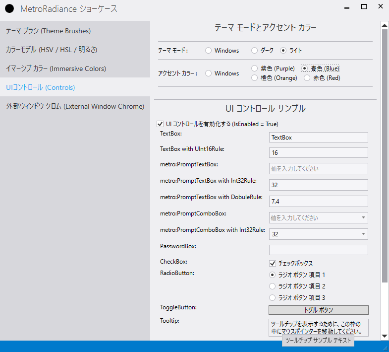
カスタムコントロール (Custom controls)
- [v3.0.0-] AcrylicBlurWindow
- Badge
- BindableRichTextBox
- BindableTextBlock
- BlurWindow
- CaptionButton
- CaptionIcon
- ExpanderButton
- LinkButton
- MetroWindow
- ProgressRing
- PromptComboBox
- PromptTextBox
- ResizeGrip
- SystemButtons
- TabView
カスタムコンバーター (Custom converters)
- WindowStateToVisibilityConverter
カスタム検証ルール (Custom validation rules)
NumberRule
- [v3.0.0-] Int16Rule
- [v3.0.0-] UInt16Rule
- Int32Rule
- [v3.0.0-] UInt32Rule
- [v3.0.0-] Int64Rule
- [v3.0.0-] UInt64Rule
- [v3.0.0-] SingleRule
- [v3.0.0-] DoubleRule
UInt16Rule (ushort)をTextBoxに利用する例
<TextBox xmlns:metro="http://schemes.grabacr.net/winfx/2014/controls">
    <TextBox.Text>
        <Binding Path="UInt16"
                 UpdateSourceTrigger="PropertyChanged">
            <Binding.ValidationRules>
                <metro:UInt16Rule Min="1"
                                  Max="49" />
            </Binding.ValidationRules>
        </Binding>
    </TextBox.Text>
</TextBox>
DoubleRule (dobule)をTextBoxに利用する例.
DoubleRuleまたはSingleRuleを利用しつつ、バインディングのUpdateTriggerとしてPropertyChangedを使いたい場合は、以下の設定を使う必要があります。
FrameworkCompatibilityPreferences.KeepTextBoxDisplaySynchronizedWithTextProperty = false;
<TextBox xmlns:metro="http://schemes.grabacr.net/winfx/2014/controls">
    <TextBox.Text>
        <Binding Path="Double"
                 UpdateSourceTrigger="LostFocus">
            <Binding.ValidationRules>
                <metro:Int32Rule Min="-4.9"
                                 Max="9.9" />
            </Binding.ValidationRules>
        </Binding>
    </TextBox.Text>
</TextBox>
UInt16Rule (ushort)をTextBoxに利用する例(検証エラーメッセージはツールチップに表示)
<TextBox xmlns:metro="http://schemes.grabacr.net/winfx/2014/controls">
    <TextBox.Text>
        <Binding Path="UInt16"
                 UpdateSourceTrigger="PropertyChanged">
            <Binding.ValidationRules>
                <metro:Int32Rule Min="1"
                                 Max="49" />
            </Binding.ValidationRules>
        </Binding>
    </TextBox.Text>
    <TextBox.Style>
        <Style TargetType="{x:Type TextBox}" BasedOn="{StaticResource {x:Type TextBox}}">
            <Style.Triggers>
                <Trigger Property="Validation.HasError"
                         Value="True">
                    <Setter Property="ToolTip">
                        <Setter.Value>
                            <Binding
                                Path="(Validation.Errors)[0].ErrorContent"
                                RelativeSource="{x:Static RelativeSource.Self}" />
                        </Setter.Value>
                    </Setter>
                </Trigger>
            </Style.Triggers>
        </Style>
    </TextBox.Style>
</TextBox>
Int32Rule (int)をmetro:PromptTextBoxに利用する例
<metro:PromptTextBox xmlns:metro="http://schemes.grabacr.net/winfx/2014/controls">
    <metro:PromptTextBox.Text>
        <Binding Path="Int32"
  UpdateSourceTrigger="PropertyChanged">
            <Binding.ValidationRules>
                <metro:Int32Rule Min="-4"
                                 Max="49" />
            </Binding.ValidationRules>
        </Binding>
    </metro:PromptTextBox.Text>
</metro:PromptTextBox>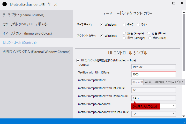
Custom behaviors
カスタム添付プロパティ (Custom attached properties)
MetroRadiance.UI.AttachedProperties.DataGridHelper
DataGridPropertiesによって提供される添付プロパティ(Attached properties)は、DataGridTextColumn / DataGridCheckBoxColumn / DataGridComboBoxColumnのエレメントスタイル(ElementStyle)をDataGridに設定することを可能とします。これにより、DataGridTextColumn / DataGridCheckBoxColumn / DataGridComboBoxColumnへのエレメントスタイルを設定を簡易化します。
- TextColumnDefaultElementStyle
- TextColumnDefaultEditingElementStyle
- CheckBoxColumnDefaultElementStyle
- CheckBoxColumnDefaultEditingElementStyle
- ComboBoxColumnDefaultElementStyle
- ComboBoxColumnDefaultEditingElementStyle
mrap:DataGridProperties.XXXDefalutElementStyle / mrap:DataGridProperties.XXXDefalutEditingElementStyleを利用する例
<Window
  ...
  xmlns:metroAP="http://schemes.grabacr.net/winfx/2014/attached-poperties">
    <DataGrid
        metroAP:DataGridProperties.TextColumnDefaultElementStyle="{DynamicResource My.Styles.DataGridTextColumn.Element}"
        metroAP:DataGridProperties.TextColumnDefaultEditingElementStyle="{DynamicResource My.Styles.DataGridTextColumn.EditingElement}"
        metroAP:DataGridProperties.CheckBoxColumnDefaultElementStyle="{DynamicResource My.Styles.DataGridCheckBoxColumn.Element}"
        metroAP:DataGridProperties.CheckBoxColumnDefaultEditingElementStyle="{DynamicResource My.Styles.DataGridCheckBoxColumn.EditingElement}"
        metroAP:DataGridProperties.ComboBoxColumnDefaultElementStyle="{DynamicResource My.Styles.DataGridComboBoxColumn.Element}"
        metroAP:DataGridProperties.ComboBoxColumnDefaultEditingElementStyle="{DynamicResource My.Styles.DataGridComboBoxColumn.EditingElement}"
        >
        <DataGrid.Columns>
           <DataGridTextColumn
               Header="Id"
               Binding="{Binding Id}"/>
           <DataGridCheckBoxColumn
               Header="CheckBox"
               Binding="{Binding Active,UpdateSourceTrigger=PropertyChanged}"
               IsThreeState="True"/>
           <DataGridComboBoxColumn
               Header="ComboBox"
               SelectedValueBinding="{Binding Selected,Mode=TwoWay,UpdateSourceTrigger=PropertyChanged}"
               DisplayMemberPath="Name"
               SelectedValuePath="Name"
               ItemsSource="{StaticResource DataItems}"/>
    </DataGrid>
...
ライセンス (License)
このライブラリーは、MITライセンス (MIT)で提供されいます。